I was sitting at the Oklahoma Writer’s Federation (OWFI) Conference banquet this weekend when the topic of half-naked men on covers came up.
Okay, I admit I was the culprit who brought said topic into the conversation. You can usually count on me to bring the naughty element into just about any situation, though in this case, I can’t remember how it happened. Somehow Jimmy Thomas was mentioned (probably by me) and then we were off to what does and doesn’t work on covers—specifically, whether half-naked men work for romance.
Oh, and if you need a little Monday wake-me-up eye candy and to know who Jimmy Thomas is, here you go.
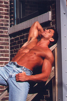
You’re welcome.
Now, for the question I want to bring to you…
When you’re perusing the bookstore isles, be it in person or electronically, what makes you pick up/click for a closer look?
Do you gravitate to the half-naked man? If so, what does the image “promise” you’ll get by picking it up? Does it convey a subconscious heat level? Or, do you shy away from the rippling abs for fear of “tainting” your bookshelf with such tawdry displays of the flesh?
I always thought I gravitated to these covers until I came home and started working through some of my favorites. Here’s the montage I came up with:
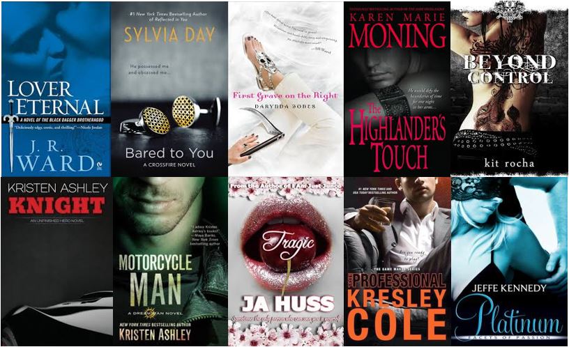
They’re all hellaciously sexy, but not as skin intensive as I’d thought.
What if the book cover in question just has symbolism? A sword, a shield, etc. To me those say fantasy, but I’m curious if it works the same for you. Paranormal, urban fantasy, or just plain fantasy are pretty easy to discern. The clothing, colors, and fonts usually clue me in, but knowing whether or not there’s a romantic element can be tricky unless both a man and woman appear on the cover.
Take, for instance, Jeanine Frost’s Night Huntress series.
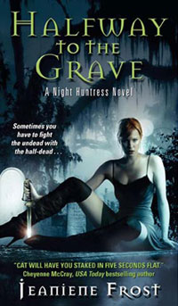
You know this is either paranormal or urban fantasy in a snap. Is there a love interest? You betcha. But I had to pick up the book to figure it out for sure.
This one was the first from Karen Marie Moning’s Faefever series.
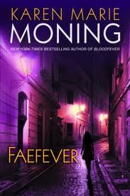
I picked it up a few times in the bookstore because I knew and loved her work from the Highlander series, but I always put it back because I didn’t think it promised much romance. (And you know I must have romance.) Not long after my last by-pass of the book, my sister stomped into my house and insisted I read it.
Holy cow, was she right. Jericho Barrons, has been one of my favorite book boyfriends ever since.
So, tell me what makes you reach for a book. Colors? Title? Muscles and rippling abs? I promise, no judgment. We’ll call this a cover preference safe space. But do me a favor, if you’ve got a particular favorite or drool-worthy one, share the link in the comments so we can drool together. 🙂

13 Comments
Jenna Jaxon
May 5, 2014 at 7:58 amGreat post! I tend to like couples on covers and bare naked men do it for me. Of course I read historicals pretty exclusively and there’s only so much flesh you can show on those. But yeah, show me some skin and I’ll probably buy.
Rhenna
May 5, 2014 at 8:55 amThey damn sure catch my eye, that’s for sure! I’ve got a few in my TBR that tempt every single time.
Sarah Hegger
May 5, 2014 at 8:50 amI like the less literal cover. I tend to shy away from the ones that will make me blush when I pay for them. Happy to see a Kristen Ashley in yours
Rhenna
May 5, 2014 at 8:55 amOh, yea! Another KA fan! So excited to know there’s another person out there I can gush with.
Stacy McKitrick
May 5, 2014 at 11:41 amI know I do NOT reach for a book if I see Jimmy Thomas on the cover. Don’t like him and turns me off quicker than anything. Is that fair? Of course not. But it is what it is.
Naked chests will have me reaching for the book to read the blurb, but that’s about it. And I rarely even do that anymore. The last book I did that with was Jaci Burton’s “Changing the Game.” Now there’s a drool-worthy cover! Book was pretty darn hot, too! Yum, yum.
Rhenna
May 5, 2014 at 12:29 pmOh, Stacy…I almost spewed coffee out my nose on the JT comment! You know, the first 732 times I saw him I on a cover, I appreciated him, but now that he’s everywhere, he’s got a lot less appeal to me too. I will say I showed his pic to a few of the ladies around the table at the banquet (thank you, technology) and I got resounding, “Ohhhhhhh”‘s.
Thanks for making me giggle. And yeah, Jaci’s cover definitely goes in the yum category.
M.Q. Barber
May 5, 2014 at 11:44 amSymbolic covers — like cufflinks or ties or apples or cherries — are fine in an aesthetic sense, but they’re so broad that they have no meaning to me. Unless I’ve already read the book and have a sense of how the imagery plays into the story, those covers don’t spark any kind of emotional need to read. But I’m not a huge fan of overmuscled hunks, either. I’d rather see realistically attractive people showing some tenderness on the cover, however clothed or unclothed they may be.
I have a few fantasy book cover prints hanging in my dining room. Dragon obsession, non-sexy. Here’s one:
Rhenna
May 5, 2014 at 12:40 pmWow! I think it’s the colors that make your sample so powerful, MQ.
I have to admit, I giggled on yours too. I had the image of the dragon swooping down to grab my food. Writers and their imagination huh?
Joanne Wadsworth
May 5, 2014 at 2:53 pmI think it’s the colors on the cover which will grab me first. A half naked man though is a very nice bonus. 🙂 I also think the cover will reflect what’s inside. Historical have a certain look, YA/NA have the girl/heroine on the cover. Military have the man holding the gun, Menage have the three hot bods on the front. I know what I’m about to buy by the look of the cover. First impressions really count for me. Then the blurb, then the first page. Thanks for the great post, Rhenna.
Rhenna
May 5, 2014 at 6:26 pmI think colors play a part for me too. I tend to be drawn to darker colors (usually). The sweet poses usually make me pass. (Don’t have to be a psychologist to figure out what I’m interested in do you? 🙂 )
Jen Colly
May 7, 2014 at 7:48 amI’m a fan of the JR Ward covers and KM Moning. Sexy teases that let your imagination fill in the blanks.
Rhenna
May 7, 2014 at 8:04 amDefinitely. Especially the early BDBs with their distinguishable covers. I could pick the book up for a re-read on color easier than title. 🙂
CJ Burright
May 8, 2014 at 4:07 pmHow did I miss this post?! For me, I love a cover that’s a bit dark (because it implies a dark element to the story, which I migrate toward). The half-naked man cover doesn’t work for me…unless there’s some sort of weapon. A sword or knives will catch my attention every time, abs or not! I always loved all of Karen Monings’ Highlander covers. Nice choices!